- My Forums
- Tiger Rant
- LSU Recruiting
- SEC Rant
- Saints Talk
- Pelicans Talk
- More Sports Board
- Fantasy Sports
- Golf Board
- Soccer Board
- O-T Lounge
- Tech Board
- Home/Garden Board
- Outdoor Board
- Health/Fitness Board
- Movie/TV Board
- Book Board
- Music Board
- Political Talk
- Money Talk
- Fark Board
- Gaming Board
- Travel Board
- Food/Drink Board
- Ticket Exchange
- TD Help Board
Customize My Forums- View All Forums
- Show Left Links
- Topic Sort Options
- Trending Topics
- Recent Topics
- Active Topics
Started By
Message

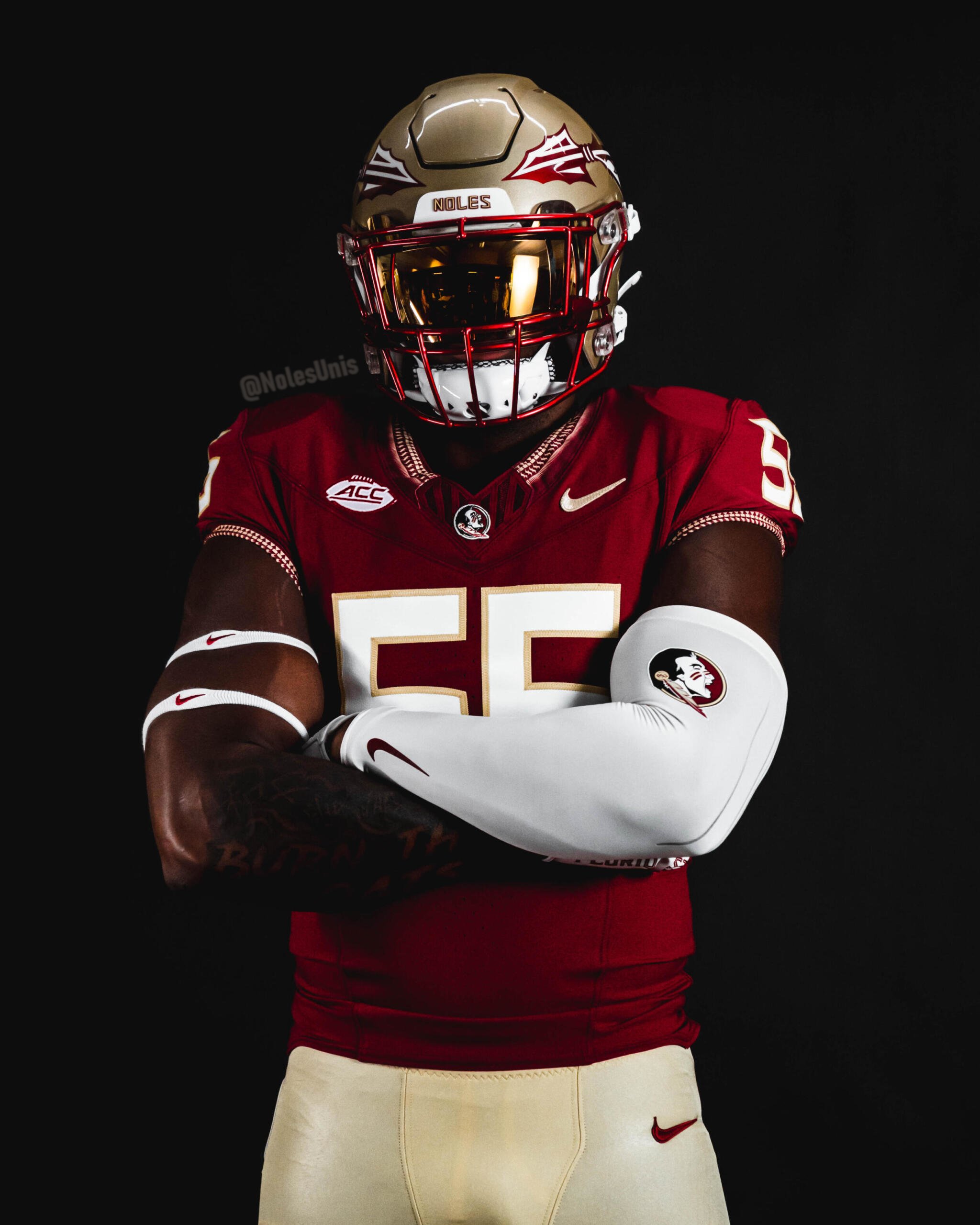
Florida State new football uniforms
Posted on 4/17/23 at 1:45 pm

Posted on 4/17/23 at 1:45 pm


Old for reference
/cdn.vox-cdn.com/uploads/chorus_image/image/61433857/usa_today_11213694.0.jpg)
I'll be honest I didn't think Nike completely ruined FSU's unis whenever they rebranded a bit in 2014 like some did. I thought the Seminole symbols were a cool touch but they were probably a bit much on the shoulders and they did a good job dialing those back. Overall I think this is an upgrade and more of a traditional look for a big name program but it does look a little like BC for some reason.
Also even though they aren't traditional, those white helmets look amazing.
 28
28

Posted on 4/17/23 at 1:50 pm to KD Burner Account
Really nice. Much better than the previous set. I don't understand how they don't have a maroon helmet option though.
Posted on 4/17/23 at 1:50 pm to KD Burner Account
they look the same to me

Posted on 4/17/23 at 1:50 pm to KD Burner Account
Posted on 4/17/23 at 1:52 pm to ForeverGator
lsu wins 52-0
Posted on 4/17/23 at 1:52 pm to KD Burner Account
Yeah those are awesome.

Posted on 4/17/23 at 1:55 pm to KD Burner Account
Yea all three of those are clean.
Posted on 4/17/23 at 1:56 pm to KD Burner Account
This combo under the lights is the best in college football.
Posted on 4/17/23 at 2:03 pm to KD Burner Account
Glad to see FSU return to a true garnet rather than that half-hearted purple they've been wearing since 2014.
Posted on 4/17/23 at 2:12 pm to KD Burner Account
I like them. I mean, frick fsu but those are nice. Glad they ditched whatever design was happening on the shoulders.
Posted on 4/17/23 at 2:16 pm to KD Burner Account
I hate FSU but these look nice. I actually dont mind the number style changes as well.
Posted on 4/17/23 at 2:17 pm to KD Burner Account
Way better.
Posted on 4/17/23 at 2:21 pm to KD Burner Account
Got rid of the cringy arm design which makes them an instant upgrade.

Posted on 4/17/23 at 2:24 pm to KD Burner Account
I didn’t hate the new era ones but they made the right call

Posted on 4/17/23 at 2:37 pm to SpartyGator
quote:
I actually dont mind the number style changes as well.
The number font is the same as it has been since 2014. They also ditched the gold numbers a few years ago.
Posted on 4/17/23 at 2:40 pm to Spelt it rong
quote:
I don't understand how they don't have a maroon helmet option though.
/cdn.vox-cdn.com/uploads/chorus_image/image/61072477/noonie.0.jpeg)
They've worn these a few times before and the helmets are kinda maroon. That said everything about the helmets/uniforms are horrific
Posted on 4/17/23 at 2:45 pm to KD Burner Account
Glad to get back to something more simple. I wish they would have gone with block numbers
Posted on 4/17/23 at 3:19 pm to KD Burner Account
They look a lot better. Wish they’d bring back the feathered collar.
Posted on 4/17/23 at 3:27 pm to jlnoles79
those are slick. can't wait to see the 'unconquered' unis
Posted on 4/17/23 at 3:30 pm to KD Burner Account
quote:
I'll be honest I didn't think Nike completely ruined FSU's unis whenever they rebranded a bit in 2014 like some did. I thought the Seminole symbols were a cool touch but they were probably a bit much on the shoulders and they did a good job dialing those back.
Nike was trying to do stuff with the panels at the time. I think part of it was because they were haveing issues fitting the shoulder stripes. UA still does stripes just on that jersey panel for a lot of teams
That being said I like the new unis. Sad they’ll lose their first game in them

 Page 1 of 3

Popular
Back to top