- My Forums
- Tiger Rant
- LSU Recruiting
- SEC Rant
- Saints Talk
- Pelicans Talk
- More Sports Board
- Fantasy Sports
- Golf Board
- Soccer Board
- O-T Lounge
- Tech Board
- Home/Garden Board
- Outdoor Board
- Health/Fitness Board
- Movie/TV Board
- Book Board
- Music Board
- Political Talk
- Money Talk
- Fark Board
- Gaming Board
- Travel Board
- Food/Drink Board
- Ticket Exchange
- TD Help Board
Customize My Forums- View All Forums
- Show Left Links
- Topic Sort Options
- Trending Topics
- Recent Topics
- Active Topics
Started By
Message

The Eye of the Tiger is an ELITE midfield logo…
Posted on 12/12/23 at 6:05 am
Posted on 12/12/23 at 6:05 am
…but on everything else from apparel to promotional material it’s not that great
 19
19

Posted on 12/12/23 at 6:12 am to MrWalkingMan
Looks good on my coffee mug.
Posted on 12/12/23 at 6:50 am to MrWalkingMan
Fix the bathrooms, and concessions, first!
Then logo it as you wish
Then logo it as you wish

Posted on 12/12/23 at 6:50 am to MrWalkingMan
Because you are not aligned. Get with the program.

Posted on 12/12/23 at 6:52 am to MrWalkingMan
would you want Toonces instead?
Posted on 12/12/23 at 6:54 am to MrWalkingMan
Looks good tattooed on my arse
Posted on 12/12/23 at 6:59 am to Nitrogen
Toonces is seriously underrated. Why don't we try him for a year at midfield and see if he gains acceptance?
Posted on 12/12/23 at 7:02 am to MrWalkingMan
Still way better than the 2002 and 2007 logos. I still refuse to buy anything that has a variation of those logos on it.

Posted on 12/12/23 at 7:03 am to MrWalkingMan
Went to a wedding this w/e and it was on the groom's cake. = tasted good too!
Posted on 12/12/23 at 7:07 am to Fight4LSU
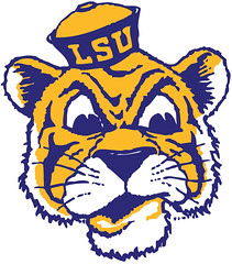
1955 and 1972 the only answer. And the only logo that I will wear on apparel.
This post was edited on 12/12/23 at 7:08 am

Posted on 12/12/23 at 7:07 am to Fight4LSU
quote:
Still way better than the 2002 and 2007 logos. I still refuse to buy anything that has a variation of those logos on it.
Sucks because those years cover some great teams.

Posted on 12/12/23 at 8:05 am to MrWalkingMan
It’s a terrible field logo. It should be the tiger head from the helmet
Posted on 12/12/23 at 8:18 am to Covingtontiger77
The 1980 one is a good throwback look.
The design firm that created Toonces should be forever ashamed. And shamed.
The design firm that created Toonces should be forever ashamed. And shamed.
Posted on 12/12/23 at 8:31 am to chimesstreet
The 1980 logo looks good on everything too.
Posted on 12/12/23 at 9:13 am to Damone
quote:
It’s a terrible field logo
Really? Terrible? I agree 100% with the OP. I think it looks great on the field, but on apparel...meh.
Posted on 12/12/23 at 9:17 am to MrWalkingMan
I the groundskeepers for TS could incorporate the Tiger Head Logo somewhere on the field. I wouldn't mind seeing it as the midfield logo.
Posted on 12/12/23 at 9:19 am to Fight4LSU
I know it’s baseball but this will always be my favorite

Posted on 12/12/23 at 9:21 am to Fight4LSU
1990 is elite
Posted on 12/12/23 at 9:53 am to MrWalkingMan
looks like purple and gold scrambled eggs. It looks terrible.
I don't have anything with that logo on it. I have the old school stuff...
I don't have anything with that logo on it. I have the old school stuff...

Posted on 12/12/23 at 10:00 am to MrWalkingMan
Totally agree. I only buy stuff with the current tiger head logo.

 Page 1 of 2

Popular
Back to top