- My Forums
- Tiger Rant
- LSU Recruiting
- SEC Rant
- Saints Talk
- Pelicans Talk
- More Sports Board
- Fantasy Sports
- Golf Board
- Soccer Board
- O-T Lounge
- Tech Board
- Home/Garden Board
- Outdoor Board
- Health/Fitness Board
- Movie/TV Board
- Book Board
- Music Board
- Political Talk
- Money Talk
- Fark Board
- Gaming Board
- Travel Board
- Food/Drink Board
- Ticket Exchange
- TD Help Board
Customize My Forums- View All Forums
- Show Left Links
- Topic Sort Options
- Trending Topics
- Recent Topics
- Active Topics
Started By
Message
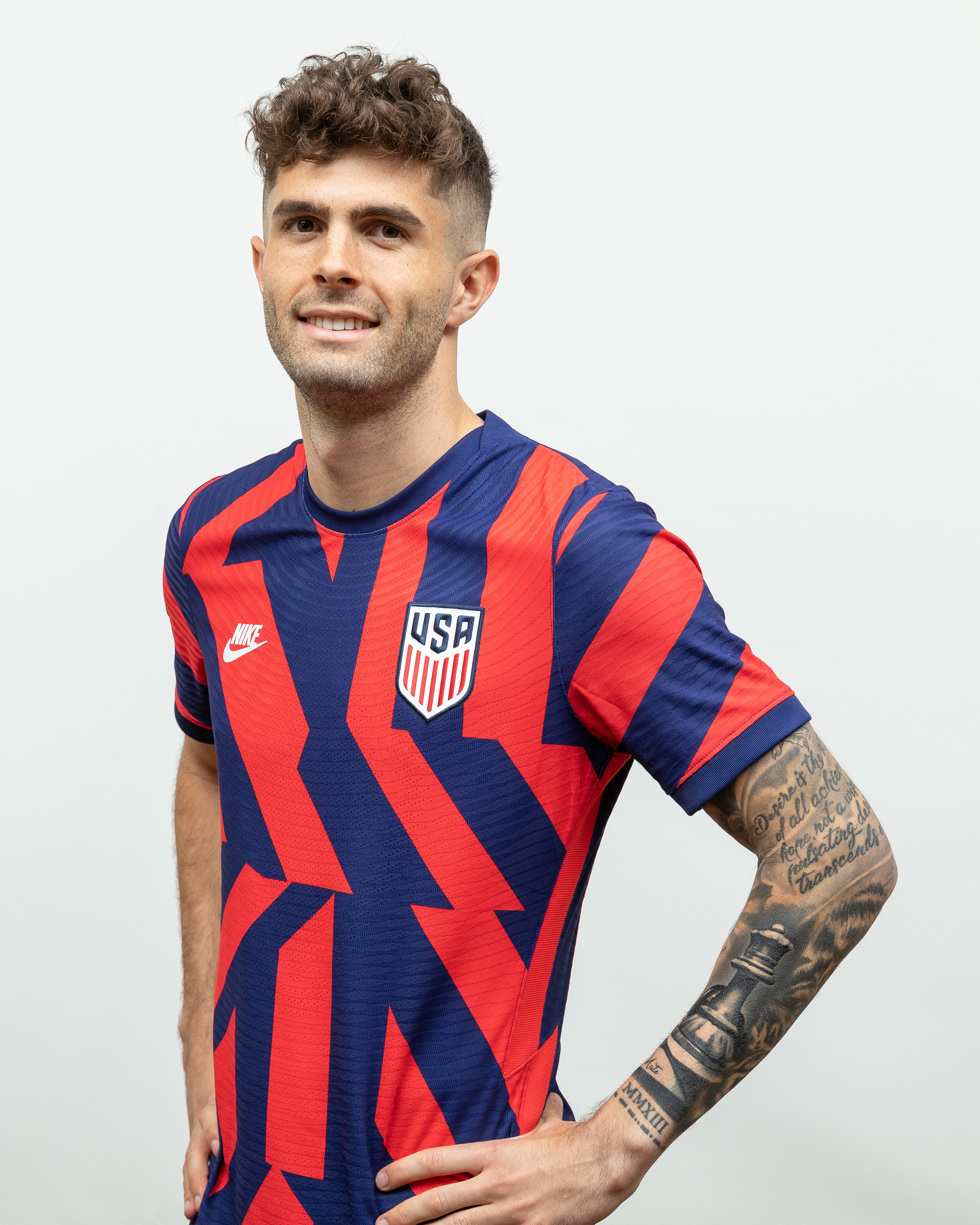
The new USA away kits are awful.
Posted on 6/16/21 at 9:33 am
Posted on 6/16/21 at 9:33 am
Even Captain America cant make it look nice.
This post was edited on 6/16/21 at 9:35 am
 21
21


Posted on 6/16/21 at 9:35 am to mizslu314
Not a fan
Posted on 6/16/21 at 9:35 am to mizslu314
I used to be a big fan of Nike's stuff, but they have been putting out some pretty terrible shite. It's not even just soccer, Rory and Koepka look like clowns out at Torrey pines this week. Just go back to the Waldos and tweak those yearly.

Posted on 6/16/21 at 9:43 am to mizslu314
yeah, those are bad
Posted on 6/16/21 at 9:47 am to mizslu314
Would be a great warm-up top. Terrible uniform though.

Posted on 6/16/21 at 9:51 am to mizslu314
Those are hideous

Posted on 6/16/21 at 9:51 am to mizslu314
Just go back to the centennial, and use those until humans no longer exist.

Posted on 6/16/21 at 10:06 am to mizslu314
Horrible. What the hell is Nike doing?
I believe national team kits should follow a traditional design to maintain an identity. This abstract stuff is just dumb.
Either bring back the Waldos or do some rendition of the 90's denims, and leave it be.
I believe national team kits should follow a traditional design to maintain an identity. This abstract stuff is just dumb.
Either bring back the Waldos or do some rendition of the 90's denims, and leave it be.
Posted on 6/16/21 at 10:06 am to mizslu314
Nike Dri Fit gives me disgusting rashes on my torso. Unfortunately I didn’t discover this until I had dropped a ton of dough on a bunch of their tennis tops.
Adidas GOAT kits - hands down better and more striking than most anything Nike has put out (although I love their Nigeria designs)
Adidas GOAT kits - hands down better and more striking than most anything Nike has put out (although I love their Nigeria designs)
This post was edited on 6/16/21 at 10:08 am
Posted on 6/16/21 at 10:22 am to mizslu314
fricking terrible. Their should be some standard uniform for home and away with alternate uniforms just in case, as well as one-off designs for some friendlies. Any home shirt from 2006 to 2015 should be the standard template, with some of my favorites being the 2012-13 hoop shirt, and the 2014 WC shirt with the collars, though that particular one looks too much like the England home shirt. For the 3rd shirt they should use the 1995 template, which was used again for the 2006 away shirt.
Here's an archive of our uniforms for reference. LINK
Here's an archive of our uniforms for reference. LINK

Posted on 6/16/21 at 10:27 am to mizslu314
That's terrible
Posted on 6/16/21 at 10:34 am to mizslu314
I don’t mind the look of those, but they look like an alternate for a youth team.
Not a national team jersey.
Not a national team jersey.
This post was edited on 6/16/21 at 10:35 am
Posted on 6/16/21 at 10:35 am to mizslu314
Looks like Nike hired a 5 year old graphic designer for the kit 

Posted on 6/16/21 at 10:54 am to mizslu314
And people were mad about the rainbow numbers
Hopefully this means we're at least keeping the current whites for now, those are great. They always go stupid for Gold Cup kits.
Hopefully this means we're at least keeping the current whites for now, those are great. They always go stupid for Gold Cup kits.
Posted on 6/16/21 at 10:58 am to Girth Donor
I’d like to know what gen z dickhead has a job at USA soccer, and is in charge of liaising with Nike. This feels like a design that came from some 24 yr olds that listen to mumble rap, and make tiktok vidz, “No cap.”
Posted on 6/16/21 at 11:08 am to BCLA
quote:
They always go stupid for Gold Cup kits
These are my runner up jerseys to the Waldos. They were one of the few good Gold Cup jerseys.


Posted on 6/16/21 at 11:09 am to mizslu314
WTF. Nike has been awful with our kits the past decade or so.
Posted on 6/16/21 at 11:14 am to SUB
Maybe not a full decade, 2010-15 had some strong entries including the Centennial and the World Cup white polo and bomb pop.
But 2016 on has been almost entirely bad.
But 2016 on has been almost entirely bad.
This post was edited on 6/16/21 at 11:15 am
Posted on 6/16/21 at 11:18 am to mizslu314
Give us an updated sash or inverse the colors of the 2008 home one.

Posted on 6/16/21 at 11:51 am to McVick
Those are going to look even worse when the numbers are added to the front and back because you're going to have three colors clashing with each other.

 Page 1 of 4

Popular
Back to top